Codename TraC: a booking platform that 35,000 travel agents open every month — built from scratch.
A new B2B booking platform for one of Europe's largest tour-operator groups, designed from a blank page to a live product used daily by agencies across Europe and the UK. One search surface for twelve product types, a basket that carries both new bookings and amendments, an AI assistant that sets up a search from a sentence — and a month of production analytics to show it is working.
Client and product names, logos and URLs withheld under NDA.
Featured offer — this week's recommendation for your sale
Curated portfolio hotels and exclusive partner stock, marked with an icon in results and filterable as a search criterion. Promotional copy varies by market and language.
Agent+ search AI
Describe the trip in your own words — I'll set up the search.
Book a product
Booking guides
Platform webinar "Basics" and booking guides are available in English. All English manuals can be found on the partner intranet.
Live webinars
Sign in for live webinars (in German) here.
Recorded webinars and Q&A
No suitable date for the live webinars? Recordings are available on demand.
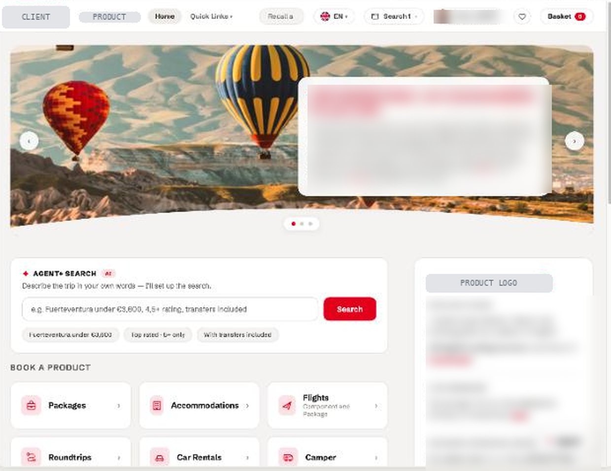
As shipped, in production
The live home screen (branding and account details withheld). Hero carousel, Agent+ search, product tiles, support rail — the structure above is the structure agents use, not a concept.
Twelve products, one front door
Flights, packages and hotels take 80% of tile clicks; nine further product types share the rest. The home screen gives every product a door without letting the long tail crowd the three that matter most.
avg 3 min 46 s on page42.1%
The basket is the workbench
Amending existing bookings is the second-busiest surface after home, and the one agents spend longest on. The basket was designed as a working object for new and amended bookings alike — and specified as a grid system so engineering could build every state of it.
Context
Travel agents sell a tour operator's products through booking software that has, historically, been built for the operator's systems rather than for the agent. The client — one of Europe's largest tour-operator groups — needed a new platform through which its partner agencies could search, assemble, book and amend trips across its entire range: packages, accommodation, flights, roundtrips, car hire, cruises, rail, tickets, campers and more. It had to work for an agent on the phone with a customer, in several languages and markets, and sit alongside the GDS and front-office systems agencies already use.
This was a new product, built from scratch rather than a redesign of an existing one. I was the single UX designer on it for the whole journey, working with the internal product and engineering teams and directly with the client's teams.
What the analytics say about who uses it, and how
The platform is now a daily working tool, not a destination people find. In one representative month: 35,558 unique agents made 145,217 visits and 1.24 million page views — an average of 8.55 pages per visit, the pattern of people working through a task rather than browsing. 98.9% of visits arrive typed or bookmarked. The remainder are deep links from agency GDS and front-office systems, which is exactly where you want the referrals to come from.
The audience is a desktop workforce: 96.5% Windows, with browser widths concentrated between 1,600 and 2,000 pixels and the majority of windows under 1,000 pixels tall. That shaped the density of the layout — agents run the platform in a window beside other tools, not full-screen. And it is used in anger across markets: the error and notification log is in German, French and English, and 98.8% of visits complete with no error at all.
My contribution
- Designed the product end to end as its only UX designer — information architecture, user flows, interaction design, visual design and prototyping for every surface, from the home screen through search, availability, basket, booking amendment and recall.
- Worked directly with the client's teams — product, commercial and agent-training — as well as the internal product and engineering teams, carrying requirements and trade-offs between them.
- Designed the Agent+ natural-language search: an AI-assisted entry point where an agent describes the trip in a sentence and the system sets up the structured search, with the interpreted criteria shown as editable chips so the agent stays in control of what was understood.
- Specified the basket as a grid system for engineering — a 12-column layout with documented column behaviour, label placement rules and measuring logic — so the most-used working surface could be built consistently across new-booking and amendment flows.
- Designed for twelve product types on one front door, with the home screen giving each a tile while the three that carry 80% of demand (flights, packages, hotels) lead.
Approach
Key design decisions
The amend-booking basket is the second-busiest page on the platform (42% of visits) and the one agents spend longest on — nearly four minutes on average. Treating amendment as a first-class flow through the same basket, rather than a separate admin screen, means an agent changing a booking uses the skills they already have from making one.
Trade-offA single basket has to carry more states — held, booked, amended, re-priced — which is why it needed a grid-system specification rather than a set of screens.
Agent+ search sits beside the structured product tiles, not instead of them. It turns a sentence into search criteria and shows the interpretation as chips the agent can edit or remove. Experienced agents keep their fast structured path; the assistant helps with the unfamiliar or the fiddly.
Trade-offTwo ways in means two things to maintain and teach. Worth it: the platform serves both twenty-year veterans and newly trained staff, and their needs differ.
The analytics confirm what observation suggested: this is a Windows desktop workforce, with most windows between 1,600 and 2,000 pixels wide and under 1,000 tall. The layout is dense by design — three-up product tiles, a persistent support rail, results that fit without scrolling — because that is how the tool is actually used.
Trade-offMobile use is negligible (22 visits in the month) and was consciously deprioritised rather than designed for by default.
Outcomes
| Result | Measure | How it was measured |
|---|---|---|
| Launched | Live and generating new business for the client | In production across European and UK agency partners; described by the client as an extremely successful product |
| 35,558 | Unique agents in one month | Production web analytics, 20 Jun – 19 Jul 2026 |
| 1.24M | Page views · 145,217 visits · 8.55 pages per visit | Same period; the depth of a task-based tool, not a browsing site |
| 98.9% | Visits arriving typed or bookmarked | Referrer data; remainder are deep links from agency GDS and front-office systems |
| 98.8% | Visits with no error or notification | Error/notification tracking across all markets and languages |
| 80% | Of product-tile clicks go to flights, packages and hotels | Link tracking on the home-screen tiles; 84,870 tile clicks in the month |
What I would do differently
Six years as the only UX designer on a product this large taught me where a single designer's leverage runs out. The design held together because I specified the hard parts as systems rather than screens — but I would push for that discipline from the first month, not when the basket got complicated. And I would instrument from day one: the analytics that now tell us where agents spend their time would have settled several early debates in an afternoon.